How to Draw a Boy in Paint Net
Ok so basically I have had some people ask me what program I use for my art, and I've said it before but I'll say it again. I use Paint.NET, it's a program similar to Photoshop although is less technical and generally speaking most of the icons are very similar to those of MS Paint. So this tutorial really only applies to Paint.NET although since it's pretty basic it should be appliable to Photoshop.
So in this Tutorial I'm going to be explaining how to do what I call Trace Drawing & Free Line Drawing. These two techniques are virtually identical so if I reference the trace itself in this tutorial, just instincitively note that with Free Line Drawing the concept will be in your head.
So a few basic things about Paint.NET. It is a very user friendly system and aside from a few buttons you'll have likely come heard of before, this shouldn't be anything new to those of you who are familiar with MS Paint. So a run down of the basic buttons.
Tool Buttons

So on the left we have the basic functions, from Top to Bottom on the left we have: Rectangular Select, Lasso Select, Circle Select, Magic Wand, Fill, Brush (Highlighted), Pencil, Stamp, Text, Rectangle & Circle. On the Right side we have: Move Pixels, Move Selection, Zoom, Pan, Gradient, Eraser, Dropper, Recolour, Line, Squircle & Brush Shape.
Of these the important ones for this tutorial will be: Magic Wand, Fill, Brush, Circle, Eraser, Dropper & Line. So I'll explain what they are just in case you don't know.
Magic Wand is a special selection tool that will select pixels in the surrounding area based on how close on the colour spectrum and opacity spectrum they are to each other. For the most part I recommend setting it to 70% as with this selecting an empty pixel will select any pixel in the surrounding area that isn't 100% opaque. Additionally, press Shift to apply the selection to apply this to the whole canvas, press Ctrl to group selections and Alt to remove a selection.
Fill is the Bucket Symbol and will fill a designated selection of pixels, it uses the same tolerance scale as the Magic Wand. Pressing Shift will apply it to all selected areas.
Brush is the highlighted, Paintbrush symbol. It allows you to freely draw lines through manipulation of the mouse. The size of the brush tip can be increased or decreased.
Circle is one of the template creation tools (along with Rectangle, Squircle & Brush Shape). Circle will allow you to create Circles, Ovals and Ellipses. To create a Circle you need to hold down shift while creating it and it will be set so it'll go from tangent to tangent, so be aware of this when doing circles. If you're doing Ovals or Ellipses you don't need to hold down Shift but draw it like you are selecting the opposite corners of a rectangle because it will not do a tangent to tangent creation.
Eraser is a useful tool if you mess up a line but don't want to undo all the way back to when you created it. As it's name implies it converts pixels to blank pixels similar to selecting a space and then pressing Delete. The Eraser Tool's tolerance can be altered to make it simply decrease the opacity of a pixel rather than completely erase the colour.
The Dropper Tool is used to select a colour, instead of finding the colour through trial and error you can simply select a colour and it will become your primary colour, right click for secondary colour.
Lastly the Line Tool allows you to create straight and curvy lines. When you first create a line, hold shift for it to lock onto certain angles, this is helpful for when doing diamonds or rotated squares. Once you've created a line you will notice four nodes on the line, two on the end and two near the middle. Moving the middle nodes will create bends while moving the outer two will shift where the end point of the line is. If you hold the Right-Mouse button instead of the left when you are doing this it will be less intense allowing for precision adjustments.
What you can See
So with that out of the way we can start. So I'll be doing a hybrid of the two by tracing a Finneon and then adding additional features, so the end result will be what I've dubbed, the Spotted Finneon.
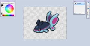
So as shown on the right, we start with a Finneon Sprite as our base template. Now while not obvious from the picture, this sprite is actually around 500x500 pixels in area as opposed to a regular Pokemon's Sprite which generally is no greater than 96x96 pixels. So by increasing its size I've decreased the quality as I have done a smooth scaling which means that as the image is increased in size it will make gradients that go from the opaque pixels to the transparent pixels.
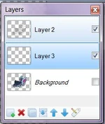
So looking at this picture again, we see some things around the Finneon picture. On the Top-Left we have the Colour Wheel which can be Activated and De-Activated with F8. Additionally in the Top-Right we have our Toolbar which is Activated and De-Activated with F5 and to its left is the layer levels which shows us all the layers and whether they're visible or not, this is Activated and De-Activated with F7. Additionally there is a fourth mini-window called the Operation History which displays all Operations that the person has performed since they started, it is Activated and De-Activated with F6, I don't recommend using it since it won't be relevant for this.
Outlines

So here we have the ribbon immediately above the previous image. Now at the moment I have it on the Line Tool as indicated by the far left where it saysTool. In addition this shows me my Brush width, my styles, fill, Shading and Blending. Of these the last two aren't relevant to this tutorial however if you do sprite art, they are helpful. So the default settings for the Brush Width and Styles are 2 with Flat Edge ends and a solid middle. I have adjusted this to the settings I use for my Pokemon fusions which is 3 with Curved Edge Ends and a Solid Middle. I recommend Curved Edge Ends because they leave a more flowing image.
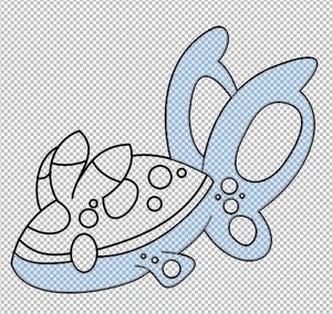
So Drawing Lines, manipulating them with the right mouse button and using the Circle Tool I have outlined the Finneon. Now note that in the Layer Mini-Window you will see I've created a new layer above the Finneon Layer. This is your Outline Layer, it is what the Outline is located on, so if I were to detick the Base Layer (Which has the Finneon Sprite on it) then I would still have the outline there. Make sure you don't draw lines on the wrong layer. I've done that a few times and it's really irritating if you don't pick it up quickly.
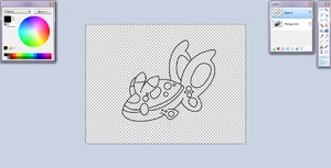
So the Outline is mostly the same however as I mentioned earlier I will also do Free Line Drawing as indicated by the third Head Fin and the multitude of spots on its body which are not on the original image. This stage is pretty simple as you won't have to worry about constantly swapping between layers.
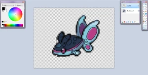
So this image to the right shows the deselected Finneon Layer so now oyu can see the outline more clearly.
Colouring
Colouring is probably the most difficult part of this as sometimes you have to really look to make sure you select the right things. If it helps, keep the Base Layer on so you can see what the colours of the original image are.
So here is the Colour Wheel at the moment. By using the Dropper Tool on the Base Layer I selected the main colours of Finneon's underbelly and tails. The light Blue shade appears on most of Finneon's underbelly and the front tail while the Dark Blue appears on its back tail fin. There is a third colour in the underbelly colouration that is a very light shade of blue for the Top of the Front Tail Fin as well as the tip of the arm Fin.
The important thing to remember about the Dropper Tool is that if you select colours in on layer, the selected colours will remain your primary and secondary on any other layer and even other images. So don't fret.

So next up here is the Magic Wand Tool, the best tool in Paint.NET in my opinion. This tool is able to select a certain group of pixels based on their colour and opacity. I highly recommend having this set to 70% tolerance as it will select every pixel in the surrounding area that isn't completely opaque from just transparent pixel. This will be needed when colouring.
So here I've used the 70% Magic Wand to select the required area. Now if you were to not hold Ctrl while selecting the pixels you would find that the Back Tail Fin isn't directly connected to the rest of the selected area. So holding control will allow you to select multiple areas.
So in the Image to the left you will see I've added another layer this time below the Outline Layer. This is a colour layer, you will soon realise you will need several if you are doing multiple colours in the same area.
So as shown here the selected area has the Dark Blue added. To select specific sections like I have, simply use the Line Tool while on the Colour Layer. Then use the Fill Tool to colour the area you want. So as shown here the area I wanted was from just behind the arm fin to the base of the Tail fin as well as most of the back tail fin.
So the next thing you can do is to create another layer, this is necessary when you have multiple colours occupying the same area, in this case I recommend starting with the Darkest Colour and adding new layers below the first colour layer in ascending order from darkest to lightest. So for the area I selected there are three colours so I would need three layers.
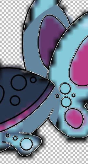
So in this image the right I've done the colours of the area previously mentioned and have recombined all the colour layers into one for future use. So to Combine layers you will see several buttons at the bottom of the Layers Mini-Window. The fourth button from the Left (the one before the up and down arrow) is the recombine layer. It will combine the selected layer to the next layer down. Make sure to only do this for the colour layers at the moment.
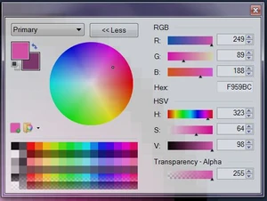
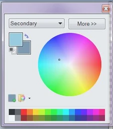
So another feature, this time in the Colour Wheel is that you can physically edit what the colour is in every way. So here I was looking at the Spots which are Pink. You'll notice the button that says "<<Less" this button normally will say "More>>", pressing it will show everything to the right of it. So with the colour wheel itself you can select a colour by pressing on a particular location. However when in the Advanced Options section you will be able to manually edit the amount of Red, Green and Blue input for the colour (Black is 0,0,0 and White is 255,255,255 just so you know). Additionally if you know the Hexadecimal value for a colour like FFFFFF or 000000 you can enter it in the next box (I wouldn't bother learning them as it's unecessary for this tutorial). Next you have your Hue, Saturation and Value. Hue will rotate the selected colour around the colour wheel on the same diametrical distance from the center. This allows you to change it to any colour on the Light Spectrum. The Saturation option will tell you how intense the colour is, basically it will move the selected colour closer or further from the center of the Colour Wheel. A minimal saturation will be on the Greyscale while a maximum Saturation will be very glary. Finally the Value Bar indicates how light or dark the colour is. It ranges from the bright to Black. Lastly is the Transparency, this will indicate how strong a colour will be when put onto the canvas. So if you have a Red Pixel and you add a 127 Transperancy Green Pixel it will make the pixel 128 Red, 127 Green as it will go half-way. Transparency isn't needed absolutely for this Tutorial but it can help.
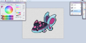
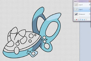
So in this next image we can see I've fully coloured the image in. I have combined all Colour Layers together (for this one there were 9 (Three for Light Blue, Two for Main Pink, Two for Secondary Pink and Two for Dark Blue). So I have left the Outline and Colour Layers uncombined to show that, along with the Base Layer you should have three layers by the end of your colouration and if you have only the outline you should only have the Outline, if you only have the colour layer on then you should only see the colours of the image. So if you've reached this point you can select the base layer and delete it with the Red Cross button in the Layer Mini-Window.
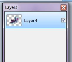
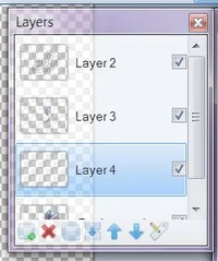
So after removing the Base Layer and combining the Outline and Colour Layer your Layer Mini-Window should look like that.
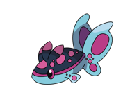
So if you've done this correclty you'll end up with a clean, image like the one on the left. You'll notice that because of the selection and colouring method there is a good gradial effect between the lines and the colours. If you are successful in your endeavours please post your results here, I want to see what you guys came up with. If you think you messed up somewhere tell me what you did and I should be able to explain it. Cheers, thanks.
Source: https://fantendo.fandom.com/wiki/User_blog:Shadow_Inferno/Basic_Paint.NET_tutorial_for_trace_drawing_&_free_line_drawing
0 Response to "How to Draw a Boy in Paint Net"
Post a Comment